Chapter 5 Content
The content of an R Markdown document includes the markdown text itself, as well as output from code chunks. Code chunks can output data, graphs, tables, and images. You can also reference variables from code chunks in markdown text.
5.1 Markdown overview
5.1.1 Type-setting
R Markdown: The Definitive Guide and this R Markdown cheatsheet provide comprehensive information on the typesetting capabilities of R Markdown.
In general, R Markdown typesetting options include *italics*, **bold**, and ~~strike-through~~.
These are achieved by wrapping text in a certain number of asterisks or tildes.
There are also (parentheses), [square brackets], and "quotation marks" that can have special functions in markdown, like creating hyperlinks: [text](link).
With many of these typesetting characters, if you highlight the text you want to format (by clicking and dragging your cursor), you can just hit the character once to wrap the text automatically. This way, you don’t have to go to the beginning and end of the text and place the characters individually.
5.1.2 Spacing
Another note about R Markdown is that line spacing matters. For example, if I wanted to include bullet points after this sentence, they wouldn’t render properly if I didn’t hit enter twice before starting them. In other words, I need to have a full line of white space before bullet points and numbered lists. If you’re having issues with your document rendering correctly, make sure you have line breaks between lists, paragraphs, and headers.
5.1.3 Working with GitHub
One of my coding/open science mentors at Penn State, Rick Gilmore, pointed out this useful piece of information to me.
Git’s version control goes line-by-line, so it’s best to put each sentence of markdown on its own line.
Otherwise, if you change one word in a sentence, the whole paragraph will appear to have changed, rather than just the one sentence.
5.2 Special characters
If you want any special characters in R Markdown, LaTeX, or pandoc to appear as text, rather than having them perform some function, you need to “escape” them with a backslash. For example, pound signs/hashtags, backslashes, and dollar signs need to be preceded by a backslash.
This also applies to any chunk outputs that contain strings with special characters, as with knitr::kable tables with LaTeX functions or characters (e.g., Greek letters like \(\eta\) to report partial eta-squared or functions like \textit{p} to italicize the text).
Sometimes you even need multiple backslashes, so you may have to play around to troubleshoot if they’re not rendering correctly.
These kinds of rendering issues won’t generally throw errors, so you’ll have to check the output in the knitted document to make sure it looks the way you want.
Speaking of LaTeX, you can engage math mode by putting dollar signs around LaTeX math commands.
This way, you can include fractions and binomials, math symbols, International Phonetic Alphabet (IPA) symbols, and the like in R Markdown (even if you’re not outputting to a PDF).
For example, I can write \(e = mc^2\) in a sentence like this just by wrapping the equation in a single set of dollar signs $e = mc^2$, or I can use two sets to center the equation $$e = mc^2$$: \[e = mc^2\]
5.3 Chunk output
Depending on the kind of content you’re creating with R Markdown, whether it’s a poster, manuscript, or internal lab document, there are several ways you can take code chunks and turn them into content.
5.3.1 Data
When I’m working on a project and checking in with my adviser on my progress, I display my raw data and analyses in R Markdown. My usual work-flow includes data pre-processing in MATLAB for EEG data—you can find my scripts for this here—and R for the ERP analyses, shown here.
As I describe in Section 7.2, I keep separate scripts for each piece of the data analysis.
I source them into one another, with a global script at the base with any general variables (like file names, HEX color codes for graphs, etc.) and custom functions.
Once I’ve built out this processing pipeline with R scripts, that’s when I’ll source them into my R Markdown documents for statistical analysis and presentation.
You can see an example of this for my ERP analyses here.
Once you’ve got your data loaded into R Markdown, you just use R code to run analyses and output them in your document as you would in a regular R script.
If I’m running regressions with lm from the stats package for example, I’ll wrap the summary function around the output.
I tend to save this as a variable, since I typically want to grab individual values from the variable later (e.g., p values).
You can put the new variable name on its own line or print it if you prefer; otherwise, you can just have a line with summary(model), and it’ll output the table in your document.
# Show first five rows of mtcars dataset
head(mtcars, 5)
## mpg cyl disp hp drat wt qsec vs am gear carb
## Mazda RX4 21.0 6 160 110 3.90 2.620 16.46 0 1 4 4
## Mazda RX4 Wag 21.0 6 160 110 3.90 2.875 17.02 0 1 4 4
## Datsun 710 22.8 4 108 93 3.85 2.320 18.61 1 1 4 1
## Hornet 4 Drive 21.4 6 258 110 3.08 3.215 19.44 1 0 3 1
## Hornet Sportabout 18.7 8 360 175 3.15 3.440 17.02 0 0 3 2# Provide summary statistics for miles per gallon (mpg) and weight (wt)
# select is from dplyr
# describe is from the psych package
mtcars %>% select(mpg, wt) %>% describe()## vars n mean sd median trimmed mad min max range skew kurtosis se
## mpg 1 32 20.09 6.03 19.20 19.70 5.41 10.40 33.90 23.50 0.61 -0.37 1.07
## wt 2 32 3.22 0.98 3.33 3.15 0.77 1.51 5.42 3.91 0.42 -0.02 0.17# Are car weight and miles per gallon correlated?
mpg_model <- lm(mpg ~ wt, mtcars)
# Save summary of model
mpg_summary <- summary(mpg_model)
# Output results
# I could have put summary(mpg_model) or print(mpg_summary) instead if I preferred
mpg_summary##
## Call:
## lm(formula = mpg ~ wt, data = mtcars)
##
## Residuals:
## Min 1Q Median 3Q Max
## -4.5432 -2.3647 -0.1252 1.4096 6.8727
##
## Coefficients:
## Estimate Std. Error t value Pr(>|t|)
## (Intercept) 37.2851 1.8776 19.858 < 2e-16 ***
## wt -5.3445 0.5591 -9.559 1.29e-10 ***
## ---
## Signif. codes: 0 '***' 0.001 '**' 0.01 '*' 0.05 '.' 0.1 ' ' 1
##
## Residual standard error: 3.046 on 30 degrees of freedom
## Multiple R-squared: 0.7528, Adjusted R-squared: 0.7446
## F-statistic: 91.38 on 1 and 30 DF, p-value: 1.294e-105.3.2 Graphs
I could’ve written an entire book on ggplot; in fact, someone already has.
I’m focusing on the R Markdown piece here, but I’ve included a lot of information on ggplot itself in Section 9.3.
Let’s start with a basic scatterplot of the miles per gallon and weight data from the mtcars dataset.
There are few ways to get the graph from your code chunk into your document.
I can just make the graph without saving it as a variable, so it automatically outputs from the chunk, or save it and put the variable name on a new line.
This is what I tend to do, as I usually create my graphs in an R script before importing them into my R Markdown document.
# Save number of cylinders (cyl) as factor
  # Otherwise, ggplot will treat it as a continuous variable
mtcars <- mtcars %>%
  mutate(cyl = as.factor(cyl))

# Create scatter plot
mtcars_scatter <- ggplot(mtcars) +
  geom_jitter(aes(mpg, wt, color = cyl)) +
  geom_smooth(formula = y ~ x, aes(mpg, wt),
              method = "lm", se = TRUE, level = 0.95,
              fill = "#d7d8db", color = "black", size = 0.5) +
  scale_y_continuous(expand = c(0,0), limits = c(0,6)) +
  scale_x_continuous(expand = c(0,0), limits = c(10,35)) +
  scale_color_brewer(type = "qual", palette = "Paired") +
  theme_classic() +
  labs(title = "Miles per gallon and vehicle weight are negatively correlated",
       y = "Vehicle weight (1000 lbs)",
       x = "Miles per gallon",
       color = "Cylinders")

# Output plot
mtcars_scatter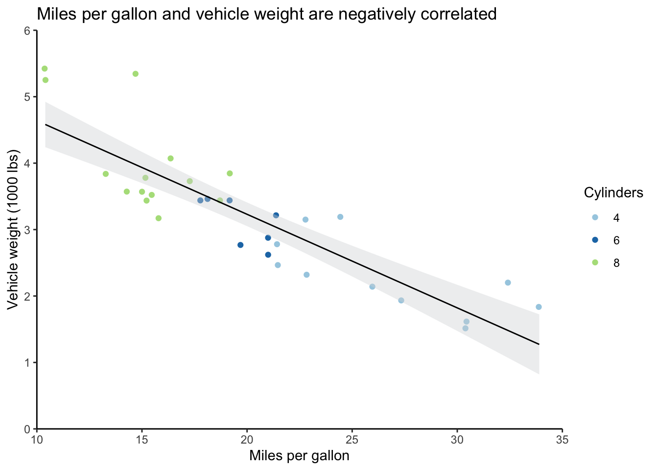
You can use the chunk options to control how this graph appears in the document.
The ones I typically use for outputting graphs are dots per inch (dpi) to control the image quality, out.width and out.height with either specific units or a percentage, and fig.align to change the alignment of the output.
In the graph below, I’ve set dpi equal to 300, the out.width at 50%, and fig.align to center.
You can also add a figure caption in the chunk header if you’d like.
These all go in the curly brackets at the top of the chunk and are separated by commas.
```{r content_graph_2, dpi=300, out.width="50%", fig.align="center"}
# Output plot with new chunk options
mtcars_scatter
```
As a note, the values for out.width and fig.align need to be in quotation marks, while the value for the dpi setting doesn’t.
Pay attention to which values have quotes around them in the column with the default values in the chunk options section of the reference guide.
You’ll get an error when you try to render the document if you don’t have appropriate quotation marks.
5.3.3 Tables
There are many ways to create tables in R. My preferred way is with knitr::kable and kableExtra.
Together these allow you to create “complex tables and manipulate table styles” as the documentation says.
You use the pipe operator %>% from magrittr the way you use the plus sign for ggplot to add layers of formatting.
If you don’t specify the output format, knitr will automatically create an HTML table for you unless you’re rendering to a PDF when it will use LaTeX.
You can override this locally in kable or globally with knitr::options.
# Get coefficients table from mpg_summary
mpg_coefs <- mpg_summary$coefficients

# Create minimal table
  # Pass table to kable, then format with kable_styling
mpg_coefs %>%
  kable() %>%
kable_styling()| Estimate | Std. Error | t value | Pr(>|t|) | |
|---|---|---|---|---|
| (Intercept) | 37.285126 | 1.877627 | 19.857575 | 0 |
| wt | -5.344472 | 0.559101 | -9.559044 | 0 |
This is obviously a very minimal table. The documentation for HTML and LaTeX tables is great, so if you’re looking for something in particular it will be relatively easy for you to find. I have a more complex example in Section 6.4.2, to which I added custom CSS code, among other things. You can see what the output of that code would look like in my Psychonomics poster.
5.3.4 Images
It’s very easy to embed images.
Just use the knitr::include_graphics function, and you can control the output as you would for a graph by specifying the chunk options.
You can also use CSS or  notation, but I find the chunk approach to be more straight-forward.
When I have very complex graphs that take a long time to render, or graphs that don’t play very nicely with R Markdown (like those from corrplot), I’ll save them as images and include them this way.
I also save graphs as images first when I need to crop them to maintain the correct aspect ratio.
This is true of the participant maps I created for my Psychonomics and CNS posters.
Instead of using knitr::include_graphics, I use image_read from the magick package to load the image, followed by the image_trim function (you can’t go straight from a ggplot graph to these functions).
5.4 Inline R
A very useful aspect of R Markdown is that you can call R objects and functions in markdown or the YAML header by sandwiching them between backticks.
For example, let’s say I want to report on the names of the flower species in the iris dataset.
# Pull species column from iris and get unique values in column
species <- iris %>% pull(Species) %>% unique()

# Print species variable
print(species)
## [1] setosa versicolor virginica
## Levels: setosa versicolor virginicaMaybe I also want to save a variable with the number of species in this list.
# Get number of unique species
species_count <- length(species)

# Print number of species
print(species_count)
## [1] 3I can call species and species_count in the markdown text to reference these variables dynamically.
I have to specify that I’m working with R code by including a lower-case r between single backticks with the variable of interest.
So if I put `r species_count` in the text, I can report that there are 3 species without writing out the number itself. I can also reference the variable with the exact species names—`r species`—in the same way: setosa, versicolor, virginica.